 icon, where it appears, provides access to further options to customise the property or import from a file browser. Clicking the
  icon resets a property to its default value.
The Property Editor displays controls associated with a selected page or item. Click the icon, where it appears, provides access to further options to customise the property or import from a file browser. Clicking the icon resets a property to its default value.
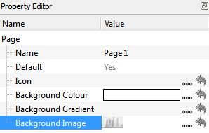
The page name (as appears in the page browser and on page switchers) can be edited and a page may be set as the default on TPC startup. An icon can be associated with the page and the background can be set as a colour, gradient and or image.
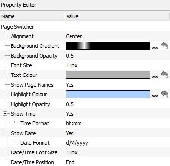
After selecting a page switcher in the page preview window, the following properties can be set:
Alignment - the alignment of the page switcher icons.
Background Gradient - set by default from the theme; select a new gradient from the gradient library, or click to launch the gradient editor.
Background Opacity - set by default from the theme.
Font Size - set by default from the theme; size of the font used to display page names.
Text Colour - set by default from the theme; colour of the text used to display page names.
Show Page Names - set by default from the theme; determines whether page names are displayed beneath the icons.
Highlight Colour - set by default from the theme; colour that surrounds the icon and page name of the currently active page.
Highlight Opacity - set by default from the theme.
Show Time - choose whether to show the time. Time layout is customisable.
Show Date - choose whether to show the date. The format of the date is customisable in a property drop down when selected.
Date/Time Font Size - set the size of the font used to show the time and date.
Date/Time Position - choose the position of the time and/or date on the page switcher.
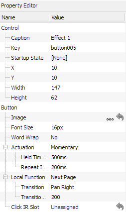
After selecting a button in the page preview window, you may adjust the following properties:
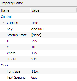
Caption - the text that appears on a button, defining its purpose. The caption of a control can be changed via the Set TPC Control Caption trigger action in Designer - see the
Key - the reference for the control within triggers in Pharos Designer. By default this will be set to <control type>XXX, where <control type> is 'button' or 'slider', etc. and XXX is a unique number for the control, which starts at 001 for a new project, e.g. button123. Setting the control key to be the same for two controls will mean that they will fire the same trigger in Designer. A single TPC trigger in Designer can match multiple control keys through the use of variables. See the
Startup State - choose which state the item should be in when the Controller starts up.
X - The position, in pixels, of the control on the horizontal axis of the screen relative to the top left corner of the control.
Y - The position, in pixels, of the control on the vertical axis of the screen relative to the top left corner of the control.
Width - The width of the control in pixels.
Height - The height of the control in pixels.
Image - choose an image to display instead of the themed shape of the button. Either choose from button images already used in the project or click to browse for a new image. Images will be stretched to fill the area of the button. Transparency in images is supported. Overall transparency of the button will still be determined by the current theme. Click to remove the image and return the button to the themed shape.
Font Size - set by default from the theme; size of the font used to display the button caption.
Word Wrap - set by default from the theme; determines whether the caption of a button will flow onto multiple lines if necessary.
Actuation - can be set to Momentary or Maintained. Momentary indicates the button will trigger a 'press' and 'release' every time it's touched; Maintained indicates the button will remain depressed when tapped once, and will only release when tapped again.
Held Timeout, Repeat Interval - specify the length of time the button must be held before 'repeat' triggers begin firing and how rapidly 'repeat' triggers fire.
Local function - can be set to: None, Next Page, Previous Page, Back, Go To Page, Increase Brightness, Decrease Brightness, Set Brightness. Each function has associated sub-properties. For example, in the screenshot below the Next Page transition can be set to None, Pan Left or Pan Right and a transition duration can be set.
Click IR Slot - This associates an IR slot with the button. The IR slot can be activated by an IR remote control, mimicking a button being tapped.
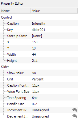
Control properties for sliders are identical to the control properties for buttons. Properties specific to sliders are:
Show Value - whether the value of the slider is displayed next to it.
Unit - this sets whether the value should be displayed as a percentage or 8-bit value (0-255).
Caption Font Size - set by default from the theme; size of the font used to display the slider caption.
Value Font Size - set by default from the theme; size of the font used to display the slider value.
Text Spacing - set by default from the theme; spacing between the slider and the first line of text, and the spacing between the caption and value.
Handle Size - set by default from the theme; fraction of the slider track that is occupied by the slider handle (0.05 - 0.95).
Increment IR Slot - this allows an IR slot to be associated with incrementing the slider level.
Decrement IR Slot - this allows an IR slot to be associated with decrementing the slider level.
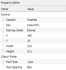
Control properties for colour pickers are identical to the control properties for buttons. Properties specific to colour pickers are:
Font Size - set by default from the theme; size of the font used to display the colour picker caption.
Text Spacing - set by default from the theme; spacing between the colour picker wheel and the caption text.
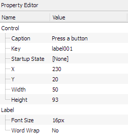
Control properties for labels are identical to the control properties for buttons. Properties specific to labels are:
Font Size - set by default from the theme; size of the font used to display the caption text in the label.
Word Wrap - set by default from the theme; determines whether the caption of a label will flow onto multiple lines if necessary.
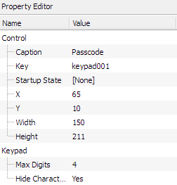
Control properties for keypads are identical to the control properties fo
r buttons. Codes entered into keypads can be processed by triggers in Designer - see the
Max Digits - set the maximum amount of characters that may be entered into a keypad by the user at a time.
Hide Characters - choose wether the characters entered into a keypad are hidden or shown.
Control properties for clocks are identical to the control properties for buttons. Properties specific to labels are:
Font Size - set by default from the theme; size of the font used to display the colour picker caption.
Text Spacing - set by default from the theme; spacing between the colour picker wheel and the caption text.