Control Panel#
Control Panel gives the people who use a system day to day a simple set of buttons, each firing a task, without exposing the rest of Cloud.
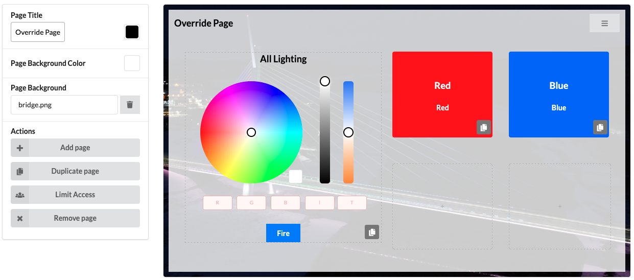
A new site needs Control Panel enabling first, which creates its first page.
Control Panel is designed to work best with mobile devices. The Control Panel editing interface adds a background grey panel to allow for easier editing.
Pages#
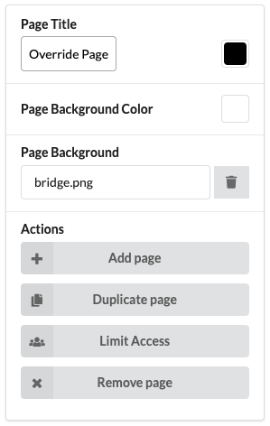
Page settings live in the Control Panel settings pane.
| Setting | Notes |
|---|---|
| Page Title | Text shown at the top left of the page |
| Page Background Colour | Specify a solid background colour for the page |
| Page Background | An uploaded image. Images fit to the page but are not scaled down, so a large file will be slow to load |
| Action | Notes |
|---|---|
| Add page | Specify where in the page order it goes |
| Duplicate page | Copies all settings including buttons to a specified page order. Pages can be moved using this functionality: first duplicate the page, then delete the original page |
| Limit Access | Select which users in the project can see the current page. Pages are silently removed from navigation when a user cannot see them |
| Remove page | Deletes the page settings. Tasks assigned to its buttons are kept |
Page types#
There are currently 6 page types which each contain different controls:
- 8 Buttons
- Provides up to 8 customisable buttons on a page which can fire a task.
- 4 Buttons + Override Controls
- Provides up to 4 customisable buttons on a page which can fire a task and a colour picker override control on the right of the page
- Override Controls + 4 Buttons
- Provides up to 4 customisable buttons on a page which can fire a task and a colour picker override control on the left of the page
- 2 Override Controls
- Provides up to 2 colour picker override controls
- Spaces
- Allows for direct Space control with feedback on devices which support Spaces
- Tags
- Allows for direct Tag control with feedback on devices which support Tags
Control configuration#
Different control types have different configuration options which can also depend on the devices in a site.
Buttons#
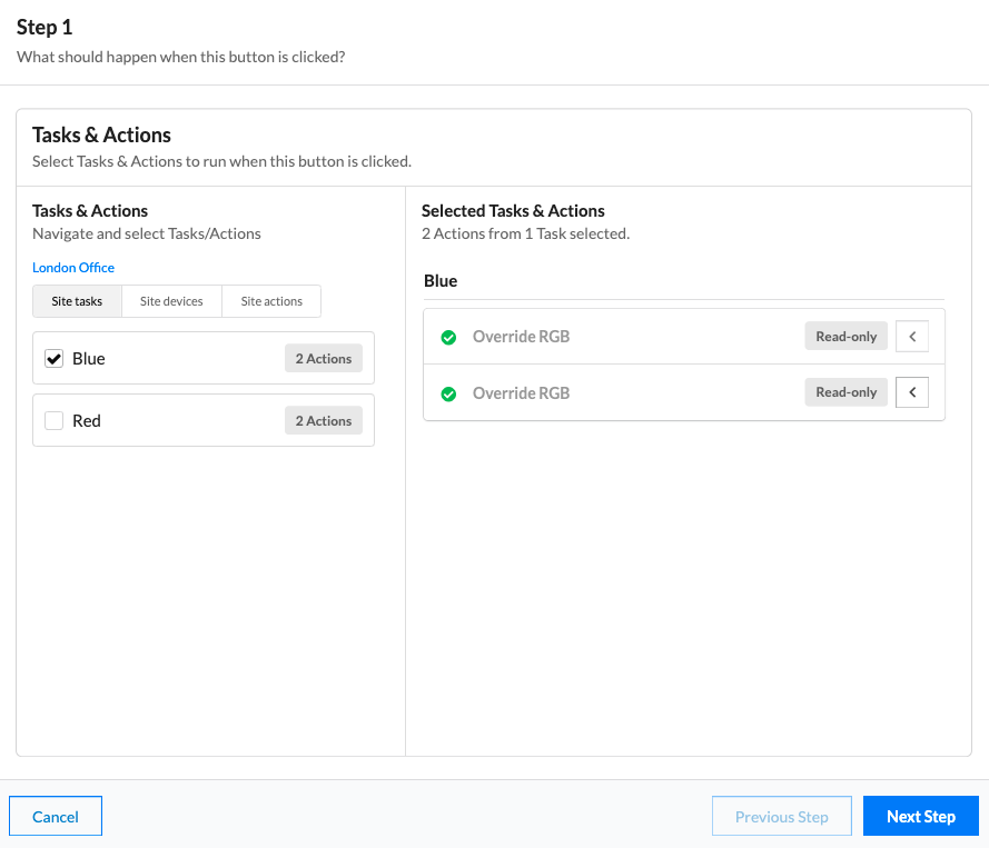
- Select a button to open its configuration.
-
Choose existing tasks for it to fire, or add new actions. Actions added here go into a new task when the button is created - rename it using the hashed-line box above the actions.
-
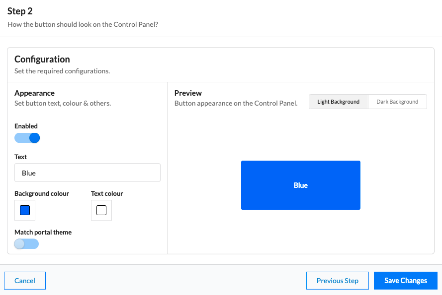
Enable the button with the toggle.
- Set the button text, then its background and text colours. The toggle matches it to the Pharos Cloud colours instead.
-
Preview shows the result. Toggle a dark or light background to see how it will look against yours.
-
Select Save Changes to save the button and create a task for any new actions.
Overrides#
- Select an override to open its configuration.
-
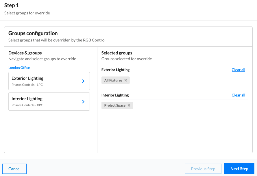
Select the fixtures which the override control should adjust. Multiple selections can be made by navigating back to the controller list once a selection has been made.
-
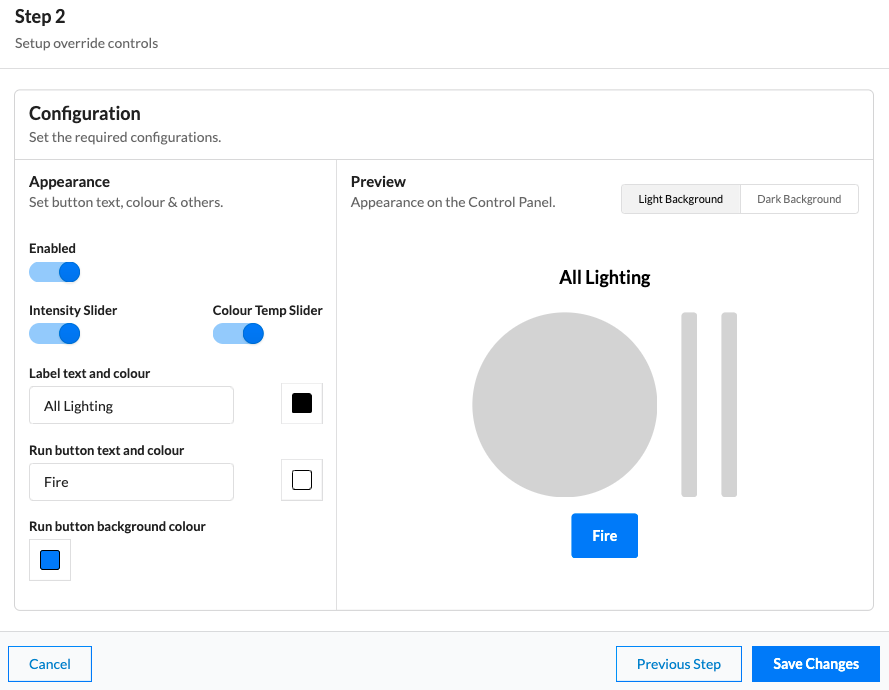
Enable the control with the toggle.
- Configure if the override should just display the colour picker, or also include intensity and colour temperature sliders.
-
Optionally label and set colours for the control.
Spaces#
The Spaces interface has very similar functionality to the Spaces tab available in supported devices. Learn more about how it operates on the Spaces page.
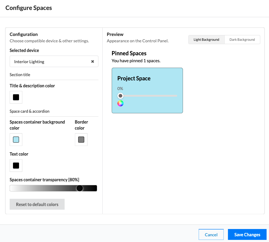
- Add a Spaces page and select (configure) it in the Control Panel editor.
-
Configure the options for the Space interface.
-
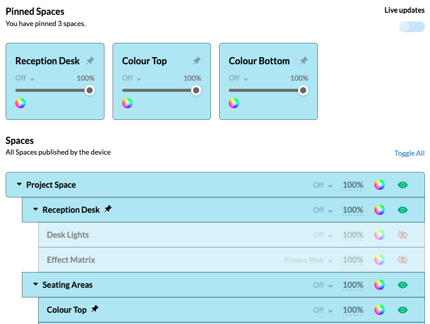
Once enabled, spaces can be edited to be pinned or hidden from users.
Tags#
The tags interface has very similar functionality to the tags tab available in supported devices. Learn more about how it operates on the Tags page.
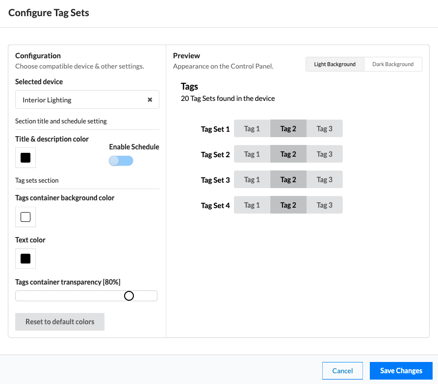
- Add a tags page and select (configure) it in the Control Panel editor.
-
Configure the options for the tags interface.
-
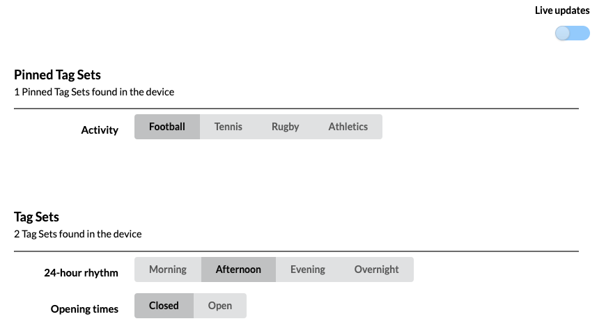
Once enabled, tags can be edited to be pinned or hidden from users.
Using Control Panel#
Select Go to Control Panel. It works in a desktop browser and is optimised for mobile.
Each site's Control Panel has its own URL, from which users cannot navigate into the wider Cloud interface - they sign in and land straight on the panel.
A user needs three permissions to use it:
- Site:View all
- Control Panel:View
- Task:Execute
Controls behave in different ways:
- Buttons - select a button to dispatch a task. No feedback is provided in the button
- Override - choose overrides and select to dispatch. No feedback is provided on the override control
- Spaces - adjust the live controller state and commit changes. See feedback of the current state. Learn more about Spaces.
- Tags - adjust the live controller state and commit changes. See feedback of the current state. Learn more about Tags.